5 Red Flags That Your Website Design is Chasing Customers Away
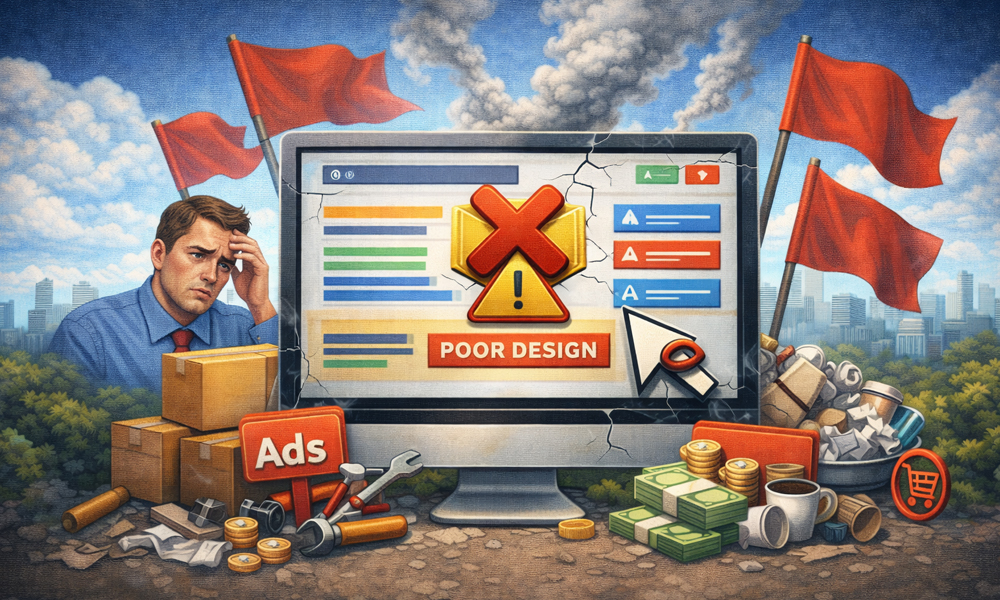
In 2026, a website is no longer just a digital business card; it is your most important salesperson. However, many business owners are unknowingly employing a "salesperson" who is rude, slow, and confusing. As user attention spans have shrunk to mere seconds, even a minor design flaw can act as a "Keep Out" sign for potential clients. If your traffic is high but your sales are low, the problem isn't your product it’s your digital environment.
A great design isn't just about aesthetics; it’s about reducing friction. When a user lands on your site, they are looking for a reason to stay, but they are even quicker to find a reason to leave. Here are five critical red flags that indicate your website design is actively working against your business growth.
1. Your Mobile Experience is an "Afterthought"
With over 70% of web traffic now originating from mobile devices, a "desktop-first" mentality is a recipe for failure. If users have to pinch, zoom, or struggle to click tiny buttons on their phones, they will leave within seconds. Google’s 2026 algorithms prioritize "Mobile First Indexing" so heavily that a poor mobile experience won't just frustrate users it will effectively hide your site from search results entirely.
A truly responsive design isn't just about making the layout fit a smaller screen; it’s about optimizing for the "thumb zone." In 2026, if your critical information or "Contact Us" buttons aren't easily reachable with a single thumb, you are losing leads. Mobile users are often on the go and have even less patience than desktop users, meaning any clunkiness in the mobile UI is a direct hit to your bottom line.
2. The "Slow Motion" Loading Speed
In the era of 5G and instant AI answers, a loading spinner is the most hated icon on the internet. If your website takes more than two seconds to become interactive, you’ve already lost half of your audience. High-resolution images that aren't optimized and heavy, uncleaned code are the most common culprits. This "digital lag" creates a feeling of unreliability; if your website is slow, customers subconsciously assume your service will be slow, too.
Beyond the user experience, speed is a core ranking factor in Google’s "Core Web Vitals." A slow site tells search engines that you aren't providing a quality environment, leading to a drop in rankings. To fix this, you must prioritize "Performance-First" design using next-gen image formats and minimizing third-party scripts. Speed is the foundation of trust in 2026; without it, the most beautiful design in the world is useless.
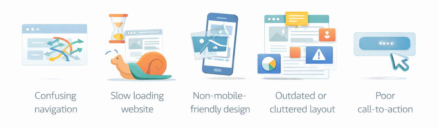
3. A Confusing "Call to Action" (CTA)
One of the biggest red flags is a website that leaves the user wondering, "What do I do next?" If your "Buy Now" or "Book a Consultation" buttons are hidden at the bottom of the page or blend into the background color, you are making your customers work too hard. A website without a clear, bold path to conversion is just a digital brochure that costs you money instead of making it.
Your CTA should be the most visually distinct element on the page. Use high contrast colors and action oriented language that tells the user exactly what happens when they click. In 2026, "minimalism" shouldn't mean "invisible." If a visitor has to scroll more than once to find out how to hire you or buy your product, your design is actively chasing them away into the arms of a competitor who makes it easier.
4. "Wall of Text" Syndrome
Nothing scares away a modern web user faster than a giant block of uninterrupted text. People don't "read" websites anymore; they scan them. If your homepage looks like a legal contract rather than a marketing tool, users will feel overwhelmed and bounce. This is especially true in 2026, where users expect information to be delivered in "snackable" chunks, supported by icons, bullet points, and high-quality imagery.
To keep visitors engaged, you must use "Visual Hierarchy." This means using bold headlines, plenty of white space, and varying font sizes to guide the eye toward the most important information. White space isn't "wasted space" it’s breathing room that allows your message to land. If your design feels cluttered and "loud," the user’s brain will take the path of least resistance: clicking the "Back" button.
5. Autoplay Media and Aggressive Pop-ups
We have all experienced the frustration of opening a website only to be blasted by unmuted video audio or blocked by three different pop-ups before even seeing the content. While "Lead Magnets" and videos are great tools, forcing them on a user the millisecond they arrive is a violation of digital etiquette. In 2026, users value privacy and control; aggressive "interstitial" ads are one of the fastest ways to destroy brand trust.
If you must use pop-ups, ensure they are "exit-intent" or timed to appear after the user has shown interest by scrolling. Similarly, videos should be muted by default, allowing the user to choose to engage. When you take away a user's control over their browsing experience, you create an annoying environment that people want to escape. A customer-centric design respects the user’s boundaries, building a relationship based on value rather than interruption.
Is Your Website Building Trust or Driving Exit Clicks?
Identifying these red flags is the first step toward reclaiming your lost revenue. A small design tweak today can lead to a massive increase in conversions tomorrow.
Leave a Comment